Med Spa Website Design: 11 Best Websites for 2025
With a compound annual growth rate (CAGR) of 17.8% over the next 10 years, the medical spa market is ripe with opportunities. And to capitalize on them, you need to build your online presence to attract and engage prospective patients. But digital marketing for your med spa is impossible without a well-designed and informative website.
So, if you want to get the most out of your existing med spa website or are planning to build one, this post is for you. Here, I discuss some of the best med spa websites you can take inspiration from and the best web design practices you must observe. These should help you stand out and build trust with potential new clients.
11 Best Medical Spa Websites
While beauty and appearance are paramount in the aesthetics industry, personalization and quality are just as vital. The med spa websites below exude all these qualities as I highlight their design, functionality, and user experience.
Marina MedSpa

Marina MedSpa’s dedication to quality service reflects its site design elements. The images of its medical aesthetic experts are professionally integrated into the overall theme, adding a personal touch.
It immediately showcases its expertise to visitors by showing the number of years and patients the medspa has under its belt. The site also features the publications it’s been on and the awards it has received. If that’s not enough, the patient reviews and before-and-after galleries help prove the effectiveness of its services, thus convincing visitors to become its patients.
Beverly Hills Med Spa

Like Marina MedSpa, Beverly Hills Med Spa features badges it received from award-giving bodies and publications it was featured in. The testimonials in the middle of the page put its expertise front and center.
The medical spa website’s feminine color theme help attract women to its wellness services, which are grouped according to body parts. Hovering over the image shows you all the services the medspa offers, which makes navigating the site much more convenient.
Visitors can find the page’s call-to-action (CTA) for booking a consultation on the fixed menu bar. It stays at the top of the page even if they scroll down. This makes contacting the medical spa much easier once visitors are convinced of its services’ effectiveness.
GLANZ Aesthetics
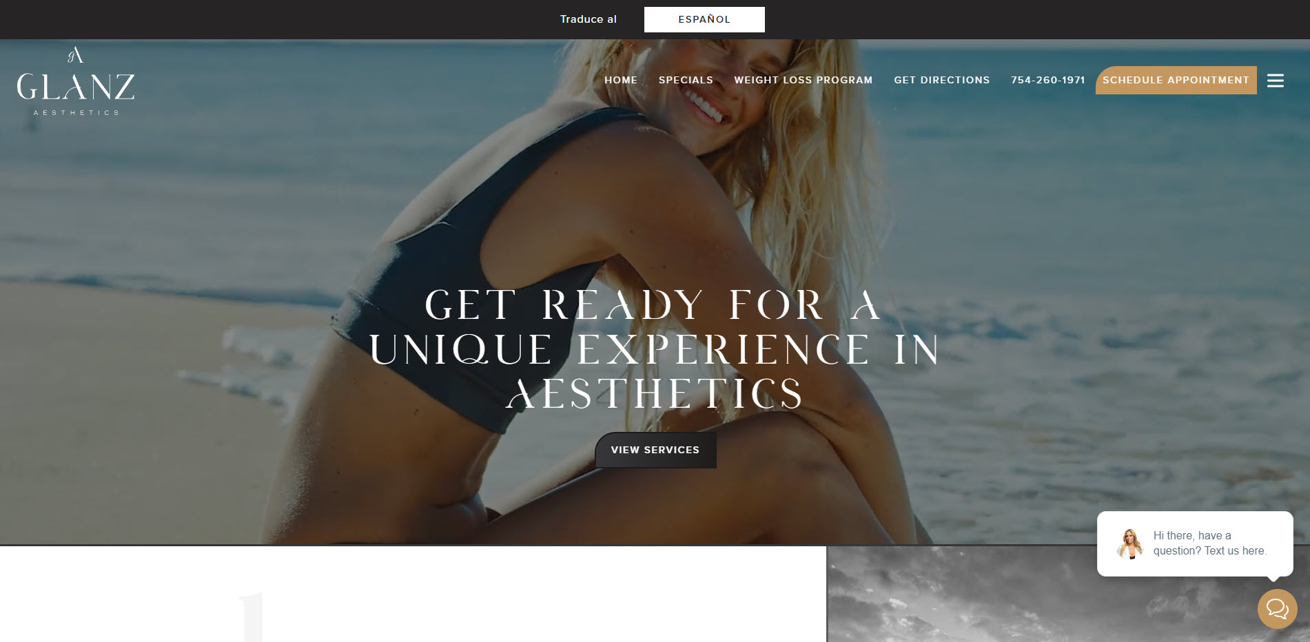
GLANZ Aesthetics uses sophisticated design elements that reflect the kind of brand it has. The judicious and unique use of overlapping elements and background effects creates an aesthetically pleasing and immersive experience.
However, its use of visual elements sets this medical spa website design apart. The above-the-fold section showcases a high-quality hero video that immediately grabs the visitors’ attention. The well-photographed shots of beautiful women further contribute to the site’s luxurious feel. The photos of its clinic’s graceful interiors also reinforce its refined brand.
The site features a fixed chat widget at the page’s bottom right part. And since the medspa caters to Miami-Dade County, where many Hispanic people reside, website visitors can toggle the site to its Spanish version. Both features make the site more accessible to its target audience, increasing its chances of turning them into patients.
SUBBIO Plastic Surgery and MedSpa
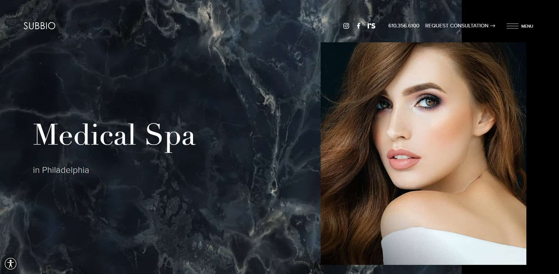
SUBBIO Plastic Surgery and MedSpa modern and marble-inspired design helps it project a sense of credibility. The site features badges from medical organizations as social proof, further building trust with its audience.
But the clinic prides itself on being the “Best Aesthetic Injectors in America.” Aside from making a case for its skincare services, SUBBIO effectively narrows its target audience to people looking for injectables like BOTOX, lip fillers, and dermal fillers.
The website uses the hamburger icon that opens an off-canvas menu containing all its important content. Hovering over the links shows a drop-down menu of the site’s different pages and services. This layout principle efficiently conveys essential information without overwhelming users, creating a practical and engaging browsing experience.
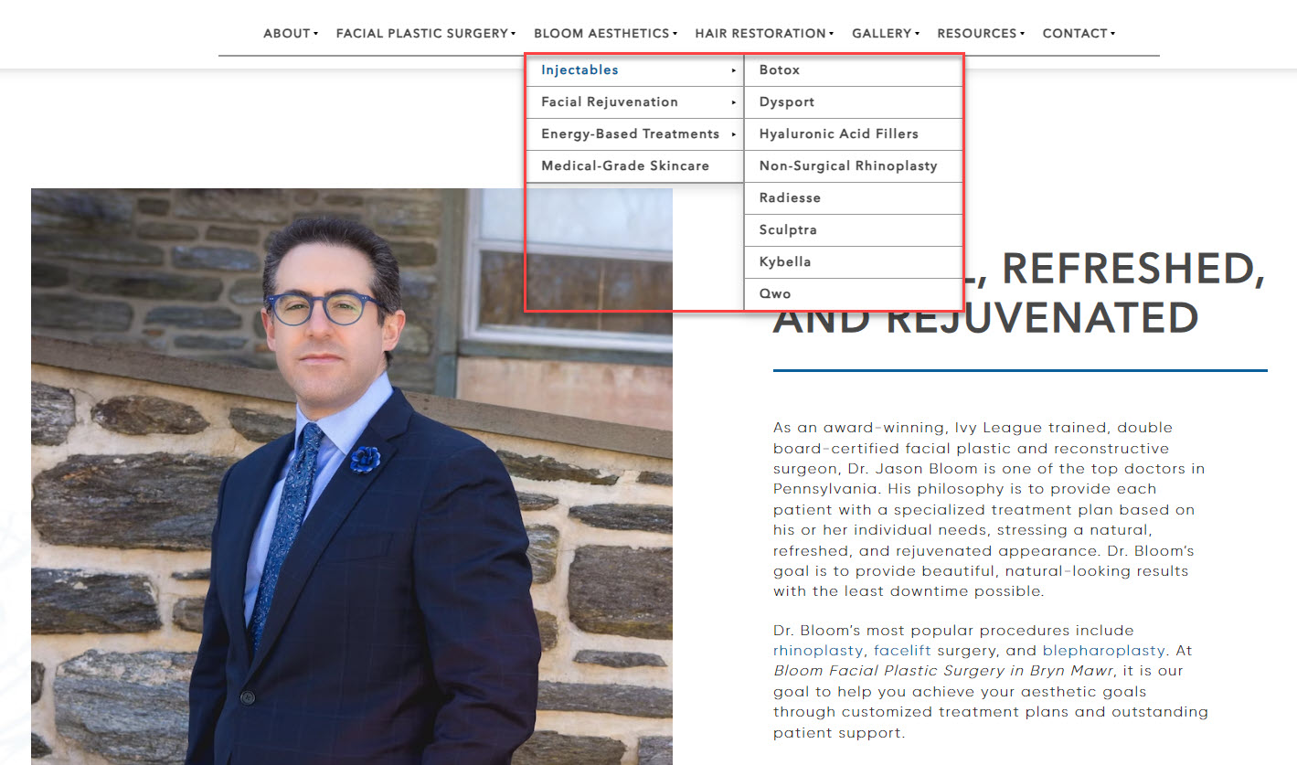
Bloom Facial Plastic Surgery

Bloom Facial Plastic Surgery opens with a hero video of its clinic and its staff entertaining its patients. The call-to-action is a video of Dr. Bloom explaining his commitment to individualized and personalized care, which the above-the-fold section achieves from the get-go.
There are sections explaining who the doctors are and their specializations to establish the site’s web design approach further. The testimonials in carousal format help give visitors a better idea of how effective the medspa’s services are. Finally, the site’s high-quality images encourage people to click on its links and learn more about the medspa’s different procedures.
Seaport MedSpa
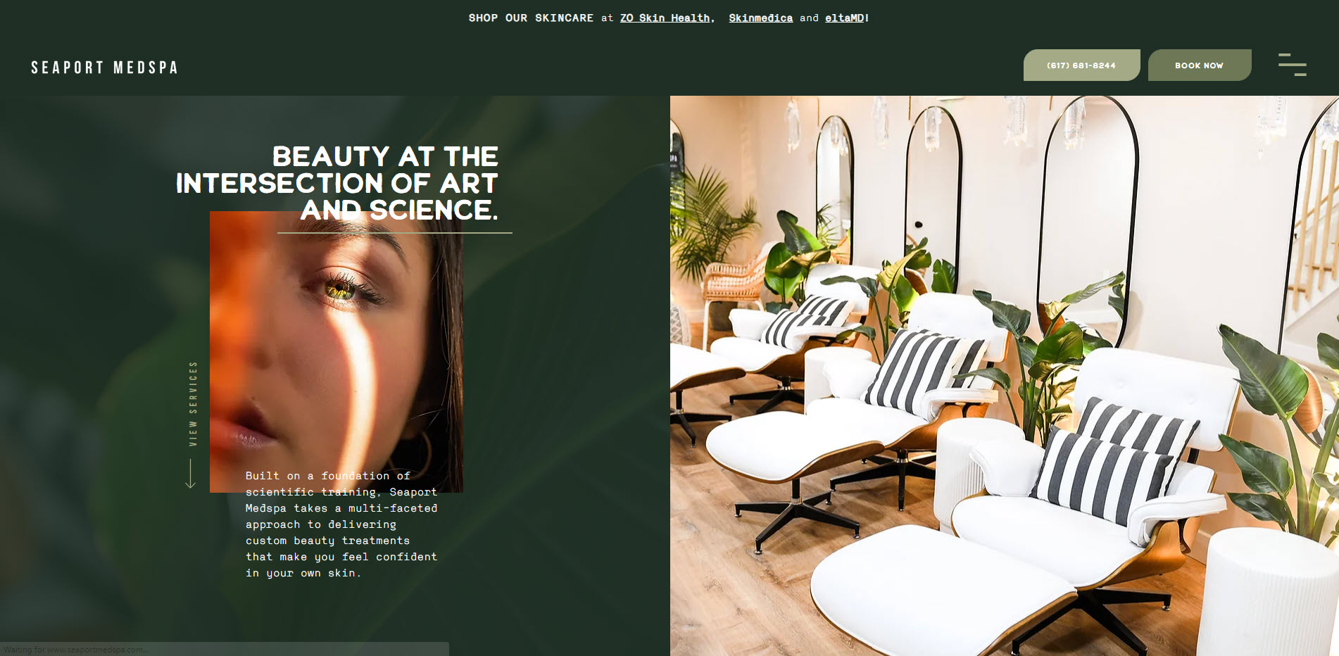
Seaport MedSpa stands out from the rest with its unconventional use of font and layout that is reminiscent of brutalist web design. The dynamic and overlapping elements give piques the interest of visitors to try and understand the medspa.
Nonetheless, the site observes common design practices to help keep it familiar to its audience. The beautiful images complement its predominantly moss green and cream color theme. Each section is organized in a way that makes booking for its procedures and buying its products much easier.
Perfect B Aesthetic Medicine
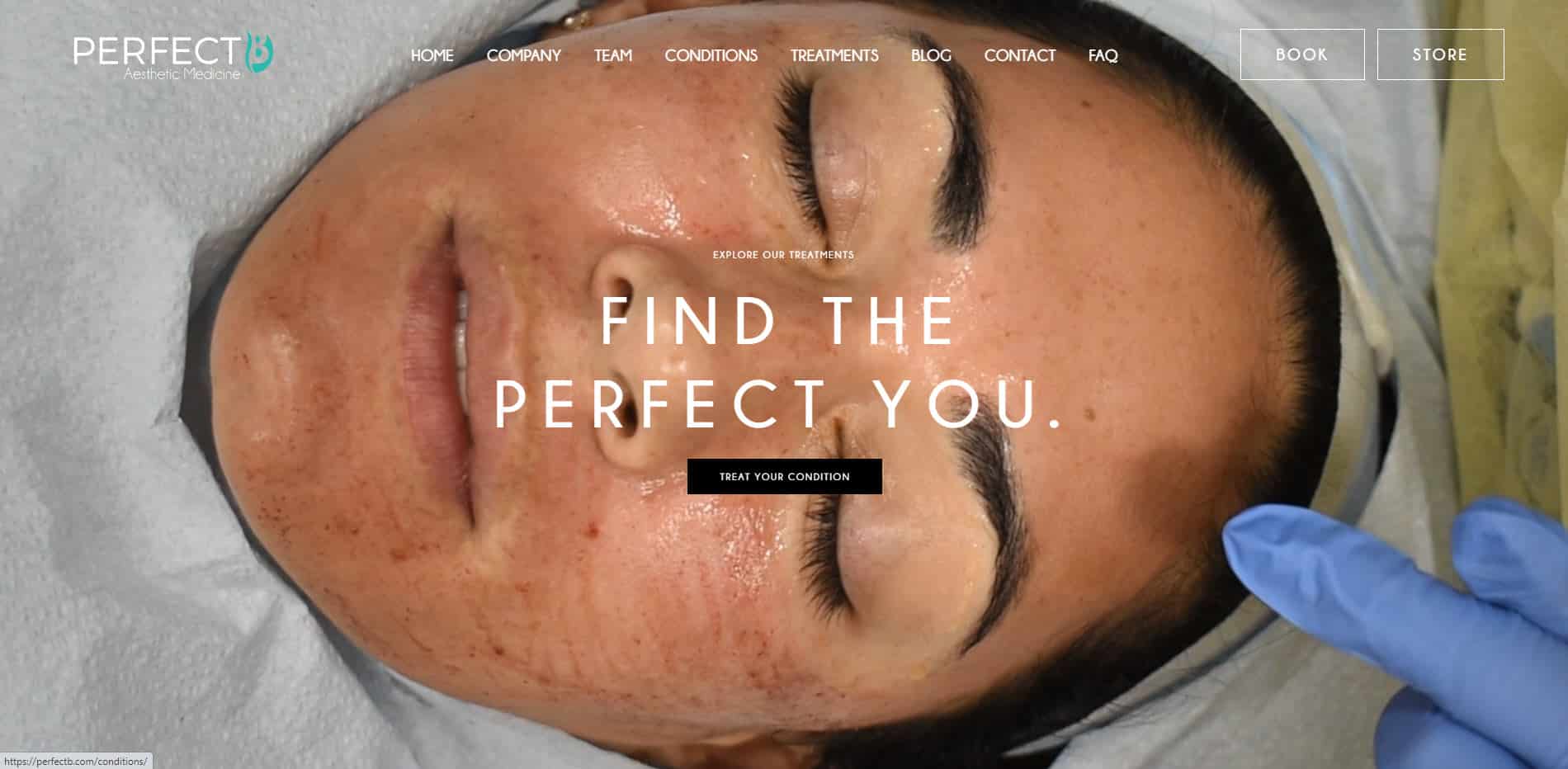
Perfect B Aesthetic Medicine’s hero video features clips of patients undergoing the various procedures the Medspa offers. It complements the site’s tagline, “natural beauty with transparent care.” Showing visitors how the aesthetic practice approaches each treatment means it has nothing to hide and everything to gain.
The site continues its dedication to transparency by using high-resolution images that show patients before, during, and after the procedures. Its testimonials section draws reviews from Google, making them more authentic than just copying and pasting them on the site.
The page’s copy is easier to read thanks to its large font sizes and equal use of white space in all sections. The large CTA buttons are difficult to miss for visitors, either, increasing the chances of people contacting the medical spa to book an appointment or buy its products.
Philadelphia Facial Plastic Surgery & Med Spa

Philadelphia Facial Plastic Surgery & Med Spa puts its doctors at the forefront of its web design. Aside from learning more about its doctors and their accreditations, visitors can read the different patient reviews on RealSelf. They can organize according to the treatment options to provide them with an informed decision on whether they should choose its services.
The predominantly white color theme gives the site a sense of spaciousness and helps the green CTA buttons to pop out. The different sections link to their pages to minimize homepage elements.
Unlike other medical spa business sites in this list, this website has no fixed CTA button for consultation scheduling. Instead, it has its phone number on the menu bar and a contact form at the bottom of the page. Stripping the web design to its bare essentials enables visitors to be more deliberate and mindful when browsing the site.
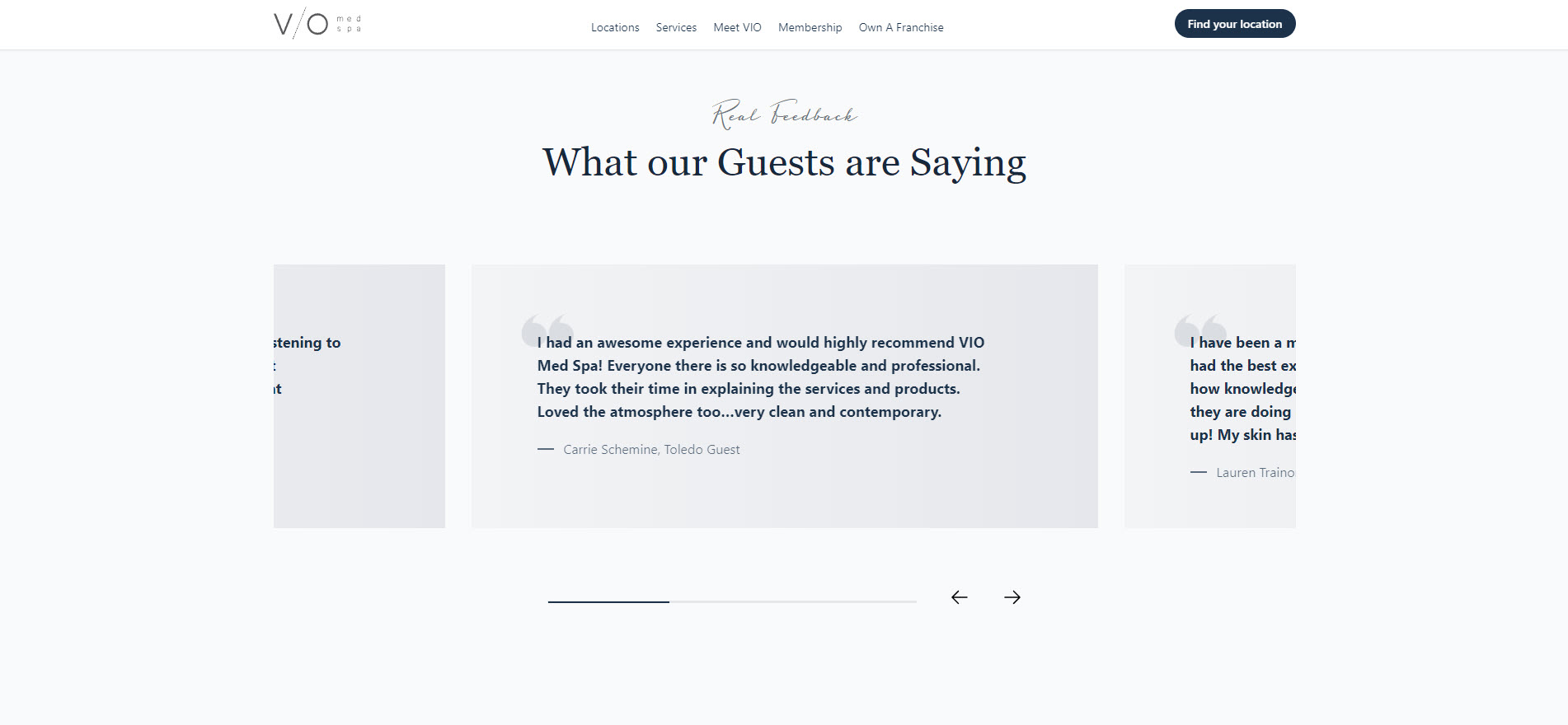
VIO Med Spa
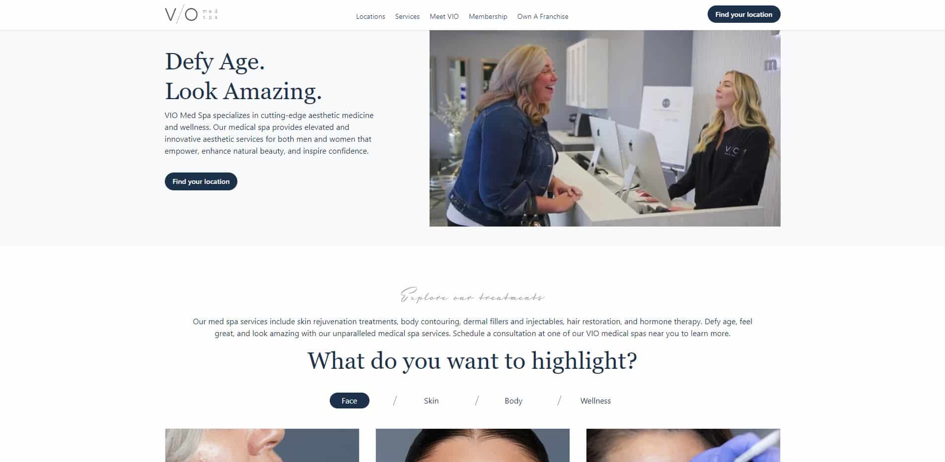
VIO Med Spa has a compact design that uses every space on the page. The above-the-fold page feels dense, thanks to the video showing how the med spa’s aesthetic medical procedures work. The treatments available logically follow this section so visitors learn more about the service that suits their needs.
Since VIO Med Spa has clinics in different locations, the site’s CTA is to help visitors locate the nearest branch to them. Clicking the button shows visitors a map of the various locations to book an appointment. The page serves as a way to establish its success and authority in the aesthetics industry.
Nuceria Health
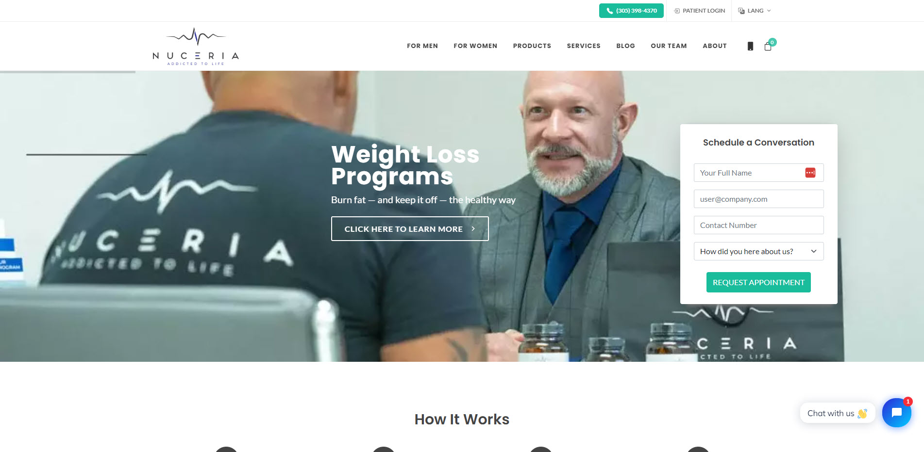
Patients of Nuceria Health can fill out the form in the above-the-fold section to request an appointment. Below the section is the step-by-step information on how visitors can use the website to receive the correct treatment protocol. And as an ecommerce store, visitors can also buy its healthcare products.
The wellness center caters to men and women, as suggested by the images used in it. There are also links to treatments available for both on the menu bar, leaving no room for misinterpretation.
Among the sites featured here, Nuceria Health is the only one that uses video testimonials on its homepage. The fact that the patients allowed themselves to be recorded with their reviews is a testament to the results of its treatments.
La Jolla Plastic Surgery & Dermatology
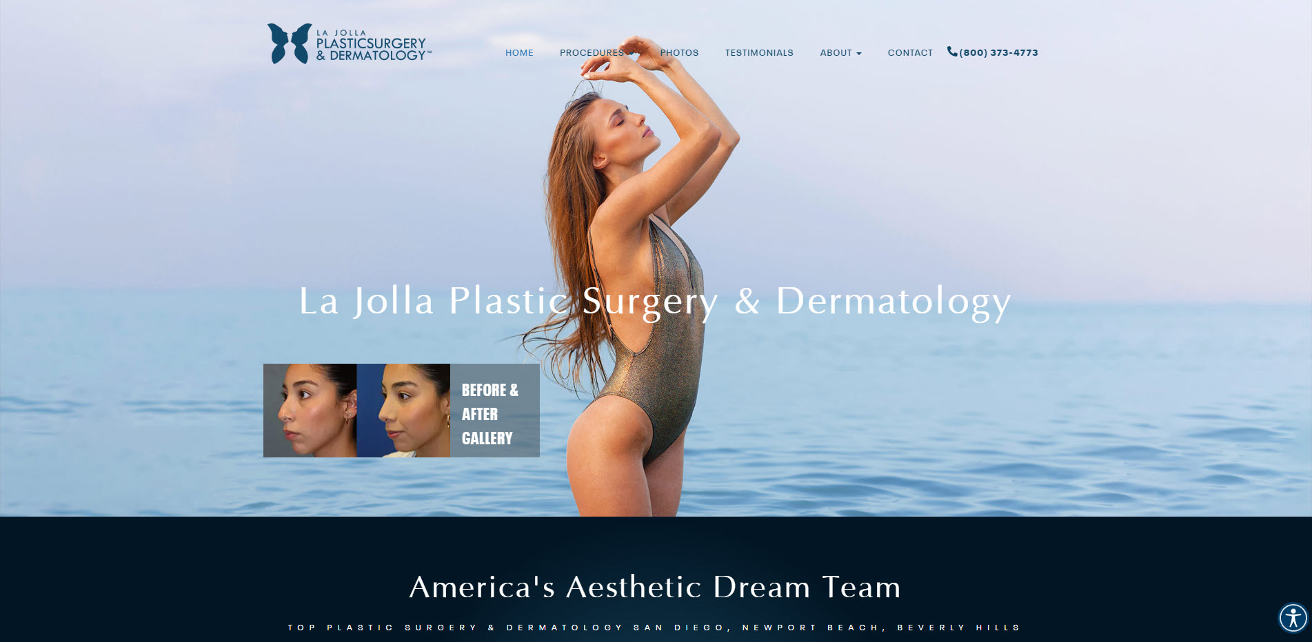
La Jolla Plastic Surgery & Dermatology’s static hero image is by design because it allows the dynamic before-and-after gallery to get your attention. Showing the results early on the homepage enables the spa to make a good first impression on visitors. Its dark blue color scheme also attests to the site’s desire to establish authority early on.
The next section is a short introduction about the doctors and their accolades to help foster trust with its audience. Building upon this, the site features a short clip where Dr. Chaffoo appears on Fox 5. This gives them an edge over sites that simply show the logo of the publications and show they were featured or appeared in.
Med Spa Web Design Best Practices
I’ve discussed all the details that each of the best medical spa websites above possess. But if I were to distill the website features that makes a website great, here are the five qualities you can consider:
Showcase Your Branding
People identify your medical aesthetics practice through your branding, as seen from your web design. It lets you establish your online presence and differentiate your medspa from others positively.
To do this, establish your branding guidelines. Determine the color palette and fonts you’ll be using on your website. Also, identify the quality of photos to feature on your site and how or where you’ll get them. Hiring a professional photographer to help capture your doctors and clinic aligned with your brand is ideal.
Finally, design a logo that visually represents your medspa. It should reflect your brand identity and values clearly to help people associate it with your practice. Similar to your photos, you may need help from an experienced graphic designer to achieve a logo your brand deserves.
Create Separate Pages for Each Service
Every medspa, including yours, offers different treatments its doctors specialize in. So, instead of featuring all your procedures on the homepage, create one for each. Focus on the benefits your potential patients will get from your procedures to compel them to try it out.
The next important step is getting your target audience to see these pages. For starters, observe the best on-page search engine optimization (SEO) practices for each. Mention its target keywords on-page elements like the title, headings, and content. This increases the chances of the page appearing on search results.
Also, build internal links to your service pages. Make them accessible on your menu so visitors can find their desired treatment. Organize the treatments into categories by creating a new page and linking to similar treatments.
Feature Social Proof Prominently
Getting your past and current patients to share their positive experiences with your medspa is a good way to convince people to sign up for them. Check your Google reviews and other third-party review sites for existing testimonials and feature them on your site.
If you don’t have reviews yet, ask old customers to leave one on their preferred review websites. Compile all reviews on a testimonials page on your site and feature the best ones on your homepage.
If possible, feature video testimonials from customers who just received their treatment from you. They provide a much better impact on people than a written review. Invite them to your clinic and record their testimonials with a professional videographer.
Use Clear and Compelling Calls to Action
Calls to action encourage visitors to take your desired action on your page. Examples include clicking on a button or filling out a form. But you need to get your visitors’ attention first for them to notice them.
Big buttons make your calls to action stand out and more visible. They must also use colors that contrast with your site’s color palette. This enables the CTAs to pop out from the screen. Finally, write an actionable copy to help close the deal with visitors. Instead of saying “Click Here” on a button, say “Get Your Free Assessment” or “Book a Consultation” instead.

Oh, and clearly show your contact information on your website so that your prospects can contact you.
Provide a Seamless User Experience
To make your site as user-friendly as possible, create a mobile-friendly version. The easiest way to do this is by using templates and themes that have a responsive design. It automatically adjusts your site’s layout to the screen size of the visitors’ device. You can run your website on Google Mobile-Friendly Test to confirm if it has a responsive and mobile-friendly design.
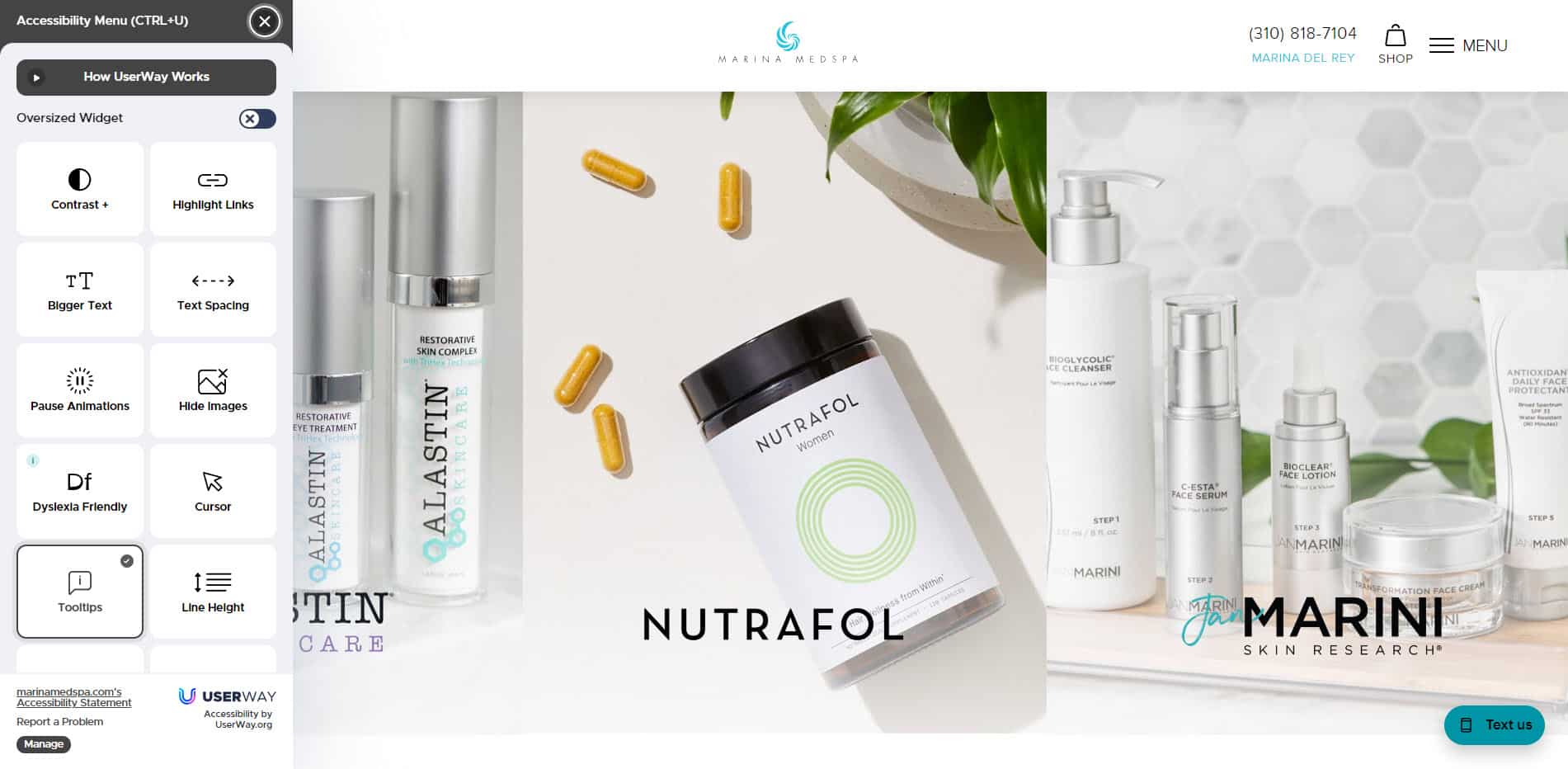
Adding accessibility features is another way to make your website easier for visitors, especially those with disabilities. It allows them to change the font size, text spacing, and color palette. There are also choices to change the text to dyslexia-friendly font and add tooltips. The latter provides additional information to visitors on elements they click on.
Let On The Map Marketing Design Your Med Spa Website
Looking for a med spa web design company that can create your site from scratch or redesign it? On The Map Marketing follows a process guaranteed to help you develop a website that establishes your unique brand and persuades your prospects. Contact us with your business requirements to get a free quote for developing your website.
Table of Contents
Dominate Your Market with Digital Marketing Services That Deliver
Talk to a certified professional today, and we will design a strategy specific to your case.